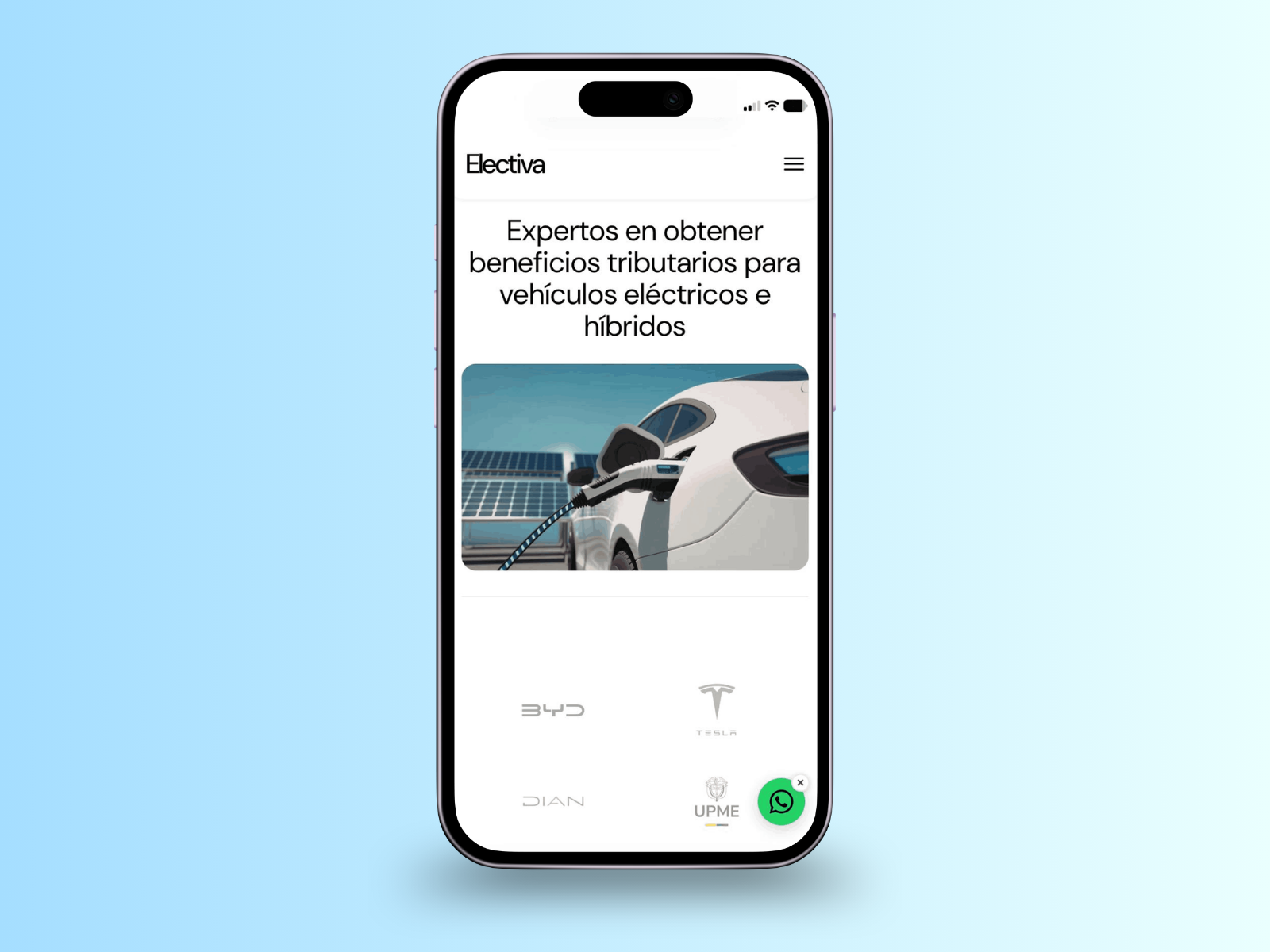
PROJECT 01 SHIPPED & BUILT 2026

Electiva Startup Web Product

A website and real-time tax benefit calculator for a Colombian EV incentive startup, built solo end to end.

Role
Product & UX Designer / Developer
Year
2026
Scope
Startup · Web · Colombia
Status
Live
Duration
2 weeks to launch, iterative since
Team
Solo, with direct client contact
Tools
HTML, CSS, JavaScript, PHP, MySQL
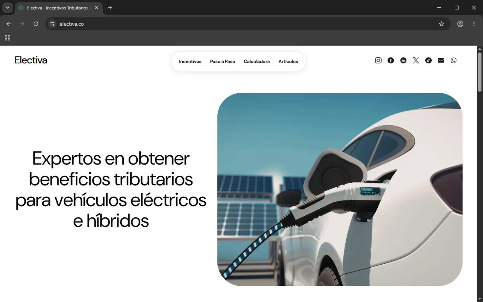
IMAGE PENDING The Electiva homepage on desktop, showing the hero section with the line about tax benefits for electric and hybrid vehicle owners in Colombia.
Visit the live site , opens in a new tab
Product Design UX Design Information Architecture Front-End Development Back-End Development CMS Design Mobile-First Design Client Communication Responsive Design Cross-Device Testing

01Overview

Colombia has real tax incentives for electric and hybrid vehicle owners. Almost nobody knows they exist, and the sites that try to explain them make that worse.

Electiva is a Colombian startup that manages the paperwork for EV and hybrid owners to claim the IVA exclusion and income tax deduction available under Ley 1715 of 2014 and Ley 2099 of 2021. When the founders approached me, they had a name, a rough content outline built in PowerPoint, and no site. I designed and built the whole product alone: the marketing pages, a step-by-step explanation of the process, a real-time savings calculator, and a small content management system so the team can publish their own articles without touching code.

The first version launched in under two weeks. Since then I've added the articles section and its CMS, and kept the site running through several rounds of bug fixes and small improvements, most recently to how article formatting renders on the public site.

02Context

FREELANCE · SOLO · NO EXISTING DESIGN SYSTEM

This was a freelance engagement for Electiva's two founders, Nestor and Marta, who needed a public-facing product before they could reasonably ask anyone to trust them with a tax process most people don't understand. There was no existing brand system, no wireframes, and no budget in the traditional sense: a flat freelance arrangement with a flexible deadline.

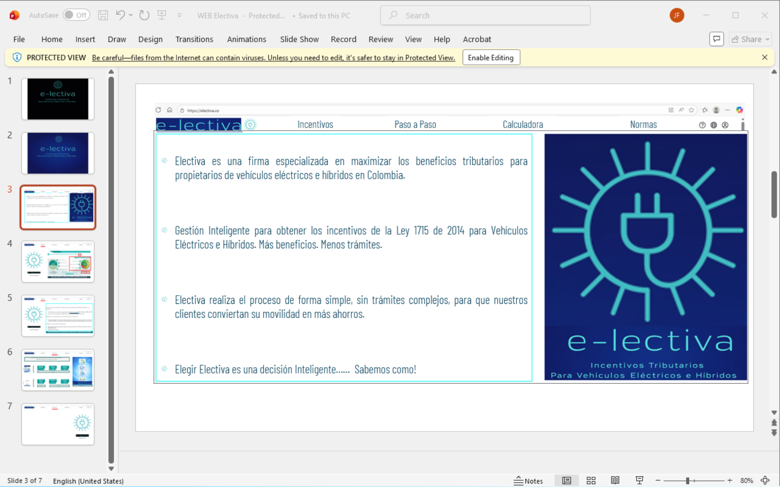
What I did have was a one-page outline the founders had put together in PowerPoint: which pages the site needed, and roughly what each one should say. That was the entire design brief. Everything else, the layout, the navigation structure, the visual language, and later the calculator and the CMS, was a decision I had to make and then explain, not one handed to me.

Constraint

There was no existing design system, no formal user research, and no analytics in place at launch. Every decision had to be justified on reasoning, not on data that didn't exist yet.

IMAGE PENDING The founders' original PowerPoint outline of the site's planned pages and content, the starting brief for the project.
The brief I started from

03The problem

Colombia's EV tax incentives are legally real but practically invisible. The information is scattered across government sites and dense legal text, and the sites that try to explain it tend to be slow, cluttered, and unclear about what a visitor is even supposed to do next. Electiva's business depends entirely on people finding the site, understanding the benefit in the first minute, and trusting it enough to hand over their documents. If the site reads like every other confusing government-adjacent page, the business has no way to acquire a client.

04Research

There was no formal research on this project. What I had was firsthand experience of the problem and direct, ongoing access to the client.

I didn't run a structured competitive analysis or user interviews. What informed the design was years of using Colombian government and financial sites as a user myself: slow load times, navigation that buries the one thing you came for, forms that don't explain what happens next. Electiva's own competitors, other firms offering the same tax-benefit service, share the same pattern. I used that pattern as the thing to design against rather than naming and screenshotting individual sites.

In place of formal personas, I worked from the founders' own description of their client: anyone who owns an EV or hybrid and wants the tax benefit, with no assumption about age or how comfortable they are with technology. That's a wide, non-technical target, which is part of why the site avoids jargon and gets to a concrete number as fast as possible.

05Process

01 Brief

Worked from a one-page PowerPoint outline of pages and content, the only design input from the founders.

02 Build

Designed and built directly in code, including the real-time calculator, with no separate design tool in between.

03 Test

Stress-tested across phone models, screen sizes, and browsers, mostly chasing mobile layout problems.

04 Extend

Shipped the articles section and its CMS after launch, then kept fixing and refining as the founders used it.

Most of the iteration on this project wasn't visual. The layout and color palette stayed close to the original direction throughout. What actually changed release over release was responsiveness and functionality: getting the site to behave correctly at every screen size, and getting the calculator and later the CMS to hold up under real use.

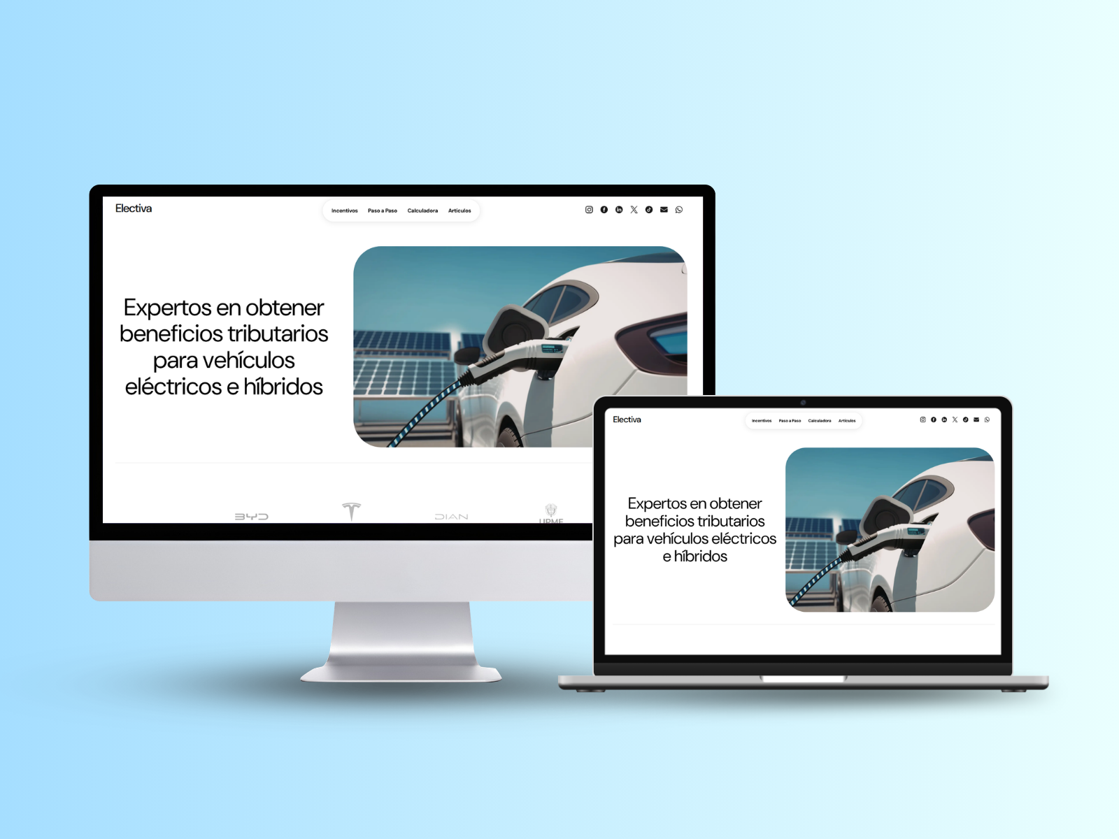
IMAGE PENDING The finished Electiva homepage on desktop.
Desktop
IMAGE PENDING The finished Electiva homepage on a phone screen.
Mobile

06Decisions

Decision 01

A shorter navbar than the client asked for

Problem
The founders' original outline put every page, directly in the main navigation.
Options
Build the navbar exactly as briefed, or reduce it to the items a first-time visitor actually needs at the top of a visit.
Chose
A trimmed navbar with only the highest-priority destinations. Everything else moved to the footer.
Why
A visitor who has never heard of Colombia's EV tax incentives doesn't need five choices before they've understood what the site is for. Every extra item in easy reach is one more decision standing between them and the explanation they came for.
Result
The founders agreed once I walked them through the reasoning. The navbar has stayed short through every later change to the site.
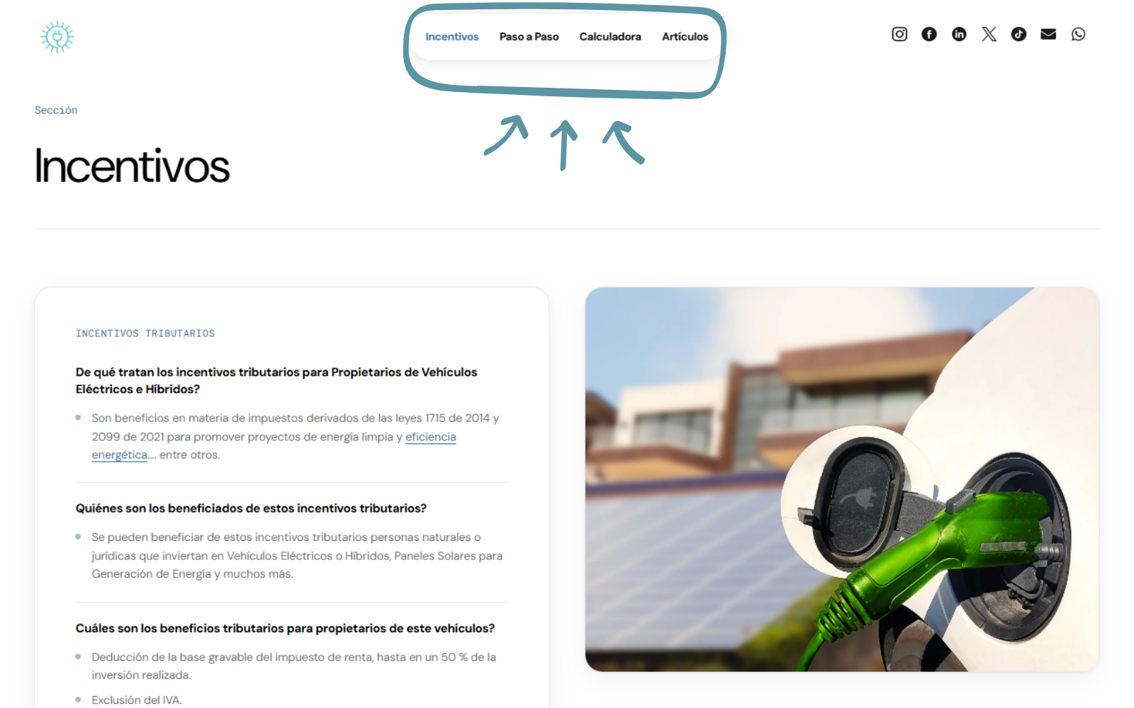
IMAGE PENDING The final, trimmed main navigation as shipped, showing only the highest-priority links.
What made it into easy reach
Decision 02

No calculate button

Problem
Financial calculators on comparable sites usually ask for an input, then a button press, then a wait for a result.
Options
Match that pattern, or make the result appear as the user types, with nothing to click and nothing to wait for.
Chose
Pure client-side calculation that runs on every keystroke and writes the result straight to the page. No button, no loading state.
Why
A visitor deciding whether Electiva's service is worth paying for is convinced by seeing the number, fast. Every extra step, a button, a spinner, is a place they could stop before they see it.
Result
The result updates in the same frame as the keystroke. The only network call on that page is the separate, optional image download, not the calculation itself.
IMAGE PENDING The calculator on desktop, showing a vehicle price entered and the full tax benefit breakdown updating live.
Desktop
IMAGE PENDING The calculator on a phone screen, showing the same live result.
Mobile
Decision 03

A downloadable result card instead of a raw number on screen

Problem
People who got a good number from the calculator had no clean way to keep it or show it to someone else, a spouse, an accountant, without an inconsistent screenshot that could cut off part of the page.
Options
Leave it to users to screenshot the browser, or build a dedicated export that renders the result as a formatted, on-brand image.
Chose
A one-tap download that generates a formatted summary card of the full result.
Why
A clean, branded export gives the user something worth keeping and gives Electiva something worth sharing, closer to usable marketing material than a rough screenshot.
Result
The card renders the same way regardless of device or browser chrome, and doubles as an asset the founders can use for their own marketing.
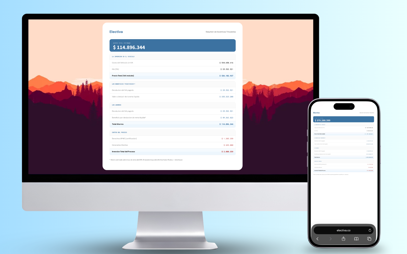
The downloadable result card generated by the calculator, showing the vehicle price, tax benefits, savings, and process costs in a formatted, on-brand summary.
IMAGE PENDING The downloadable result card generated by the calculator, showing the vehicle price, tax benefits, savings, and process costs.
The result card a user actually downloads
Decision 04

A desktop-only admin panel, on purpose

Problem
The articles CMS needed a rich text editor and image uploads for the founders to publish their own content, on a limited build timeline.
Options
Build a fully responsive admin that also works on a phone, or restrict authoring to desktop and say so clearly.
Chose
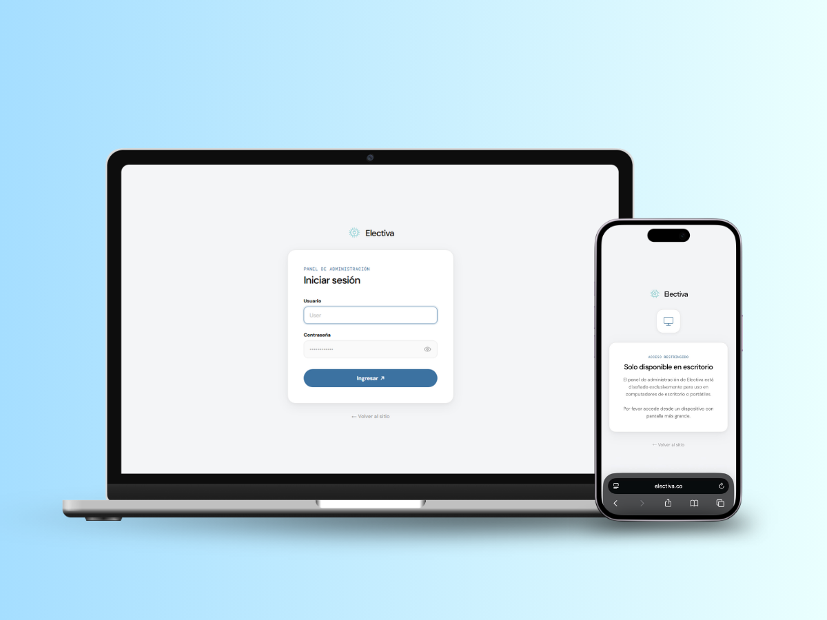
The admin panel blocks mobile browsers outright, with its own on-brand screen explaining why, rather than a cramped rich-text editor squeezed into a small screen.
Why
Writing an article happens at a desk in practice. Building and testing a mobile rich-text editor would have spent real time on a workflow nobody was going to use.
Result
The admin panel matches the public site's visual language instead of feeling bolted on, and there was no mobile editor to debug.

07Outcome

LIVE · ONGOING

Electiva has been live since launch, and the founders have used it as their main channel for new client inquiries. Contact through the site's WhatsApp link and contact form has stayed in the hundreds since launch, though that number comes from the founders' own count of conversations rather than a tracked dashboard, since there's no analytics in place yet. The founders haven't run a dedicated marketing push, so this is closer to an early read than a settled result.

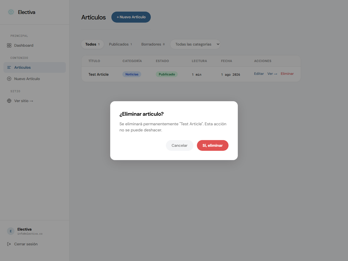
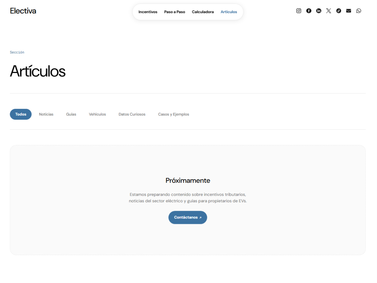
The articles section and its CMS shipped after the initial build, and the founders have started publishing through it directly. I've continued to maintain the site since launch, most recently fixing how article formatting rendered on the public pages, less a feature in itself than a signal that the site is actively kept rather than handed off and forgotten.

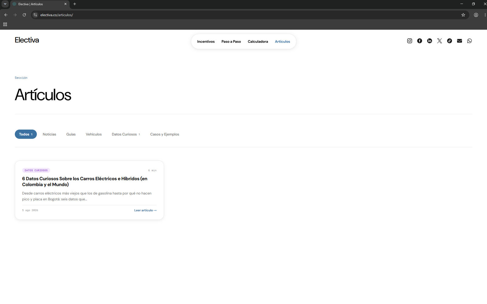
IMAGE PENDING The public Articulos page showing at least one published article, demonstrating the content section as used by the founders.
What the founders publish through the CMS

08Reflection

The most useful part of this project wasn't the calculator or the CMS. It was learning to explain a design decision to a client instead of just building what was asked.

Working solo across design and development meant every UX decision also had to survive being explained to two non-technical founders who had their own instincts about the site. The navbar was the clearest example: the easy path was to build what was briefed. Making the case for something different, and having it land, taught me more about the job than the build itself did.

The clearest gap looking back is measurement. I stress-tested devices and browsers hard, but the only testing this site ever got from actual people was five friends and family members, and there is still no analytics in place to tell me what's working for a stranger landing on the site cold.

Limitation

There is no formal usability testing behind this site, only informal sessions with five people who already knew me, and no analytics dashboard to check assumptions against real visitor behavior.

still counting inquiries by hand, no dashboard yet