PROJECT 03 RESEARCH & PROTOTYPE 2026

Steam UX Purchase Flow Research & Design Follow-Up

A joint academic study of Steam's purchase flow, and the interactive refund-visibility fix I designed and built afterward, on my own, as a follow-up.

Role
UX Researcher & Interaction Designer
Year
2026
Scope
Bachelor Thesis · Steam · Solo Design Follow-Up
Status
Prototype, Untested
Duration
One academic term for the joint research, part of one summer for the solo design follow-up
Team
Joint thesis research with Cristian De Santis, solo design and build for the follow-up
Tools
HTML, CSS, JavaScript
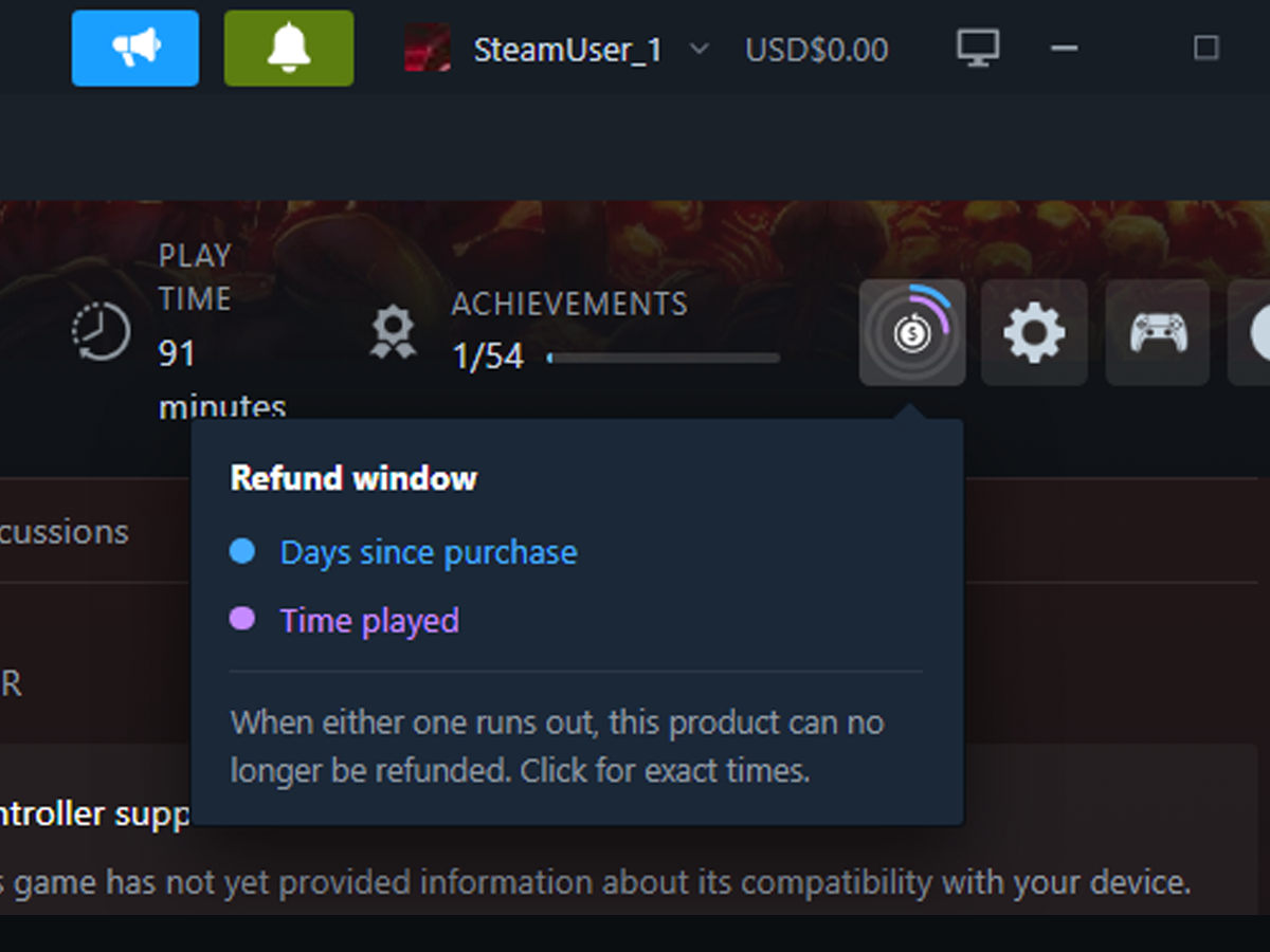
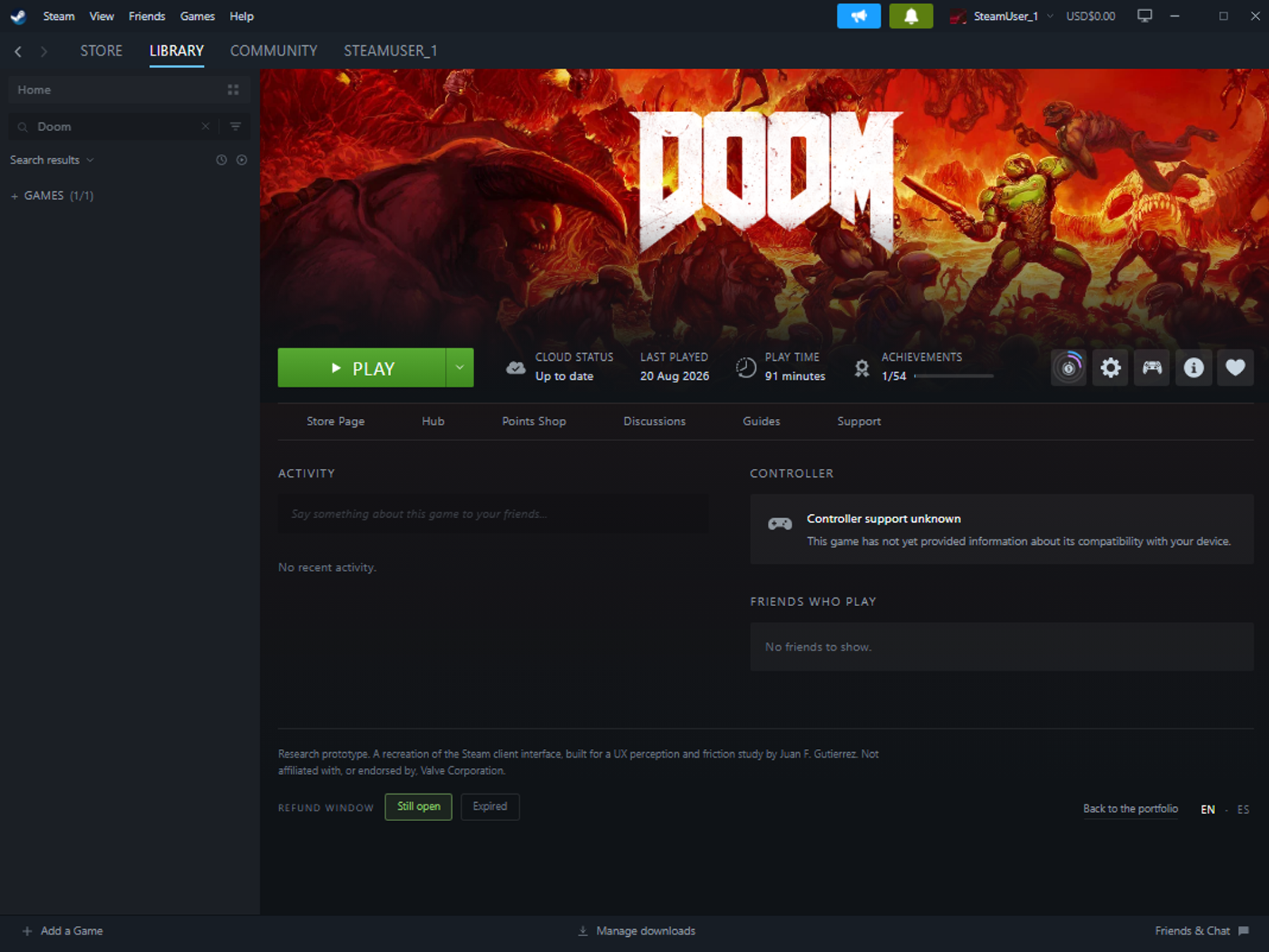
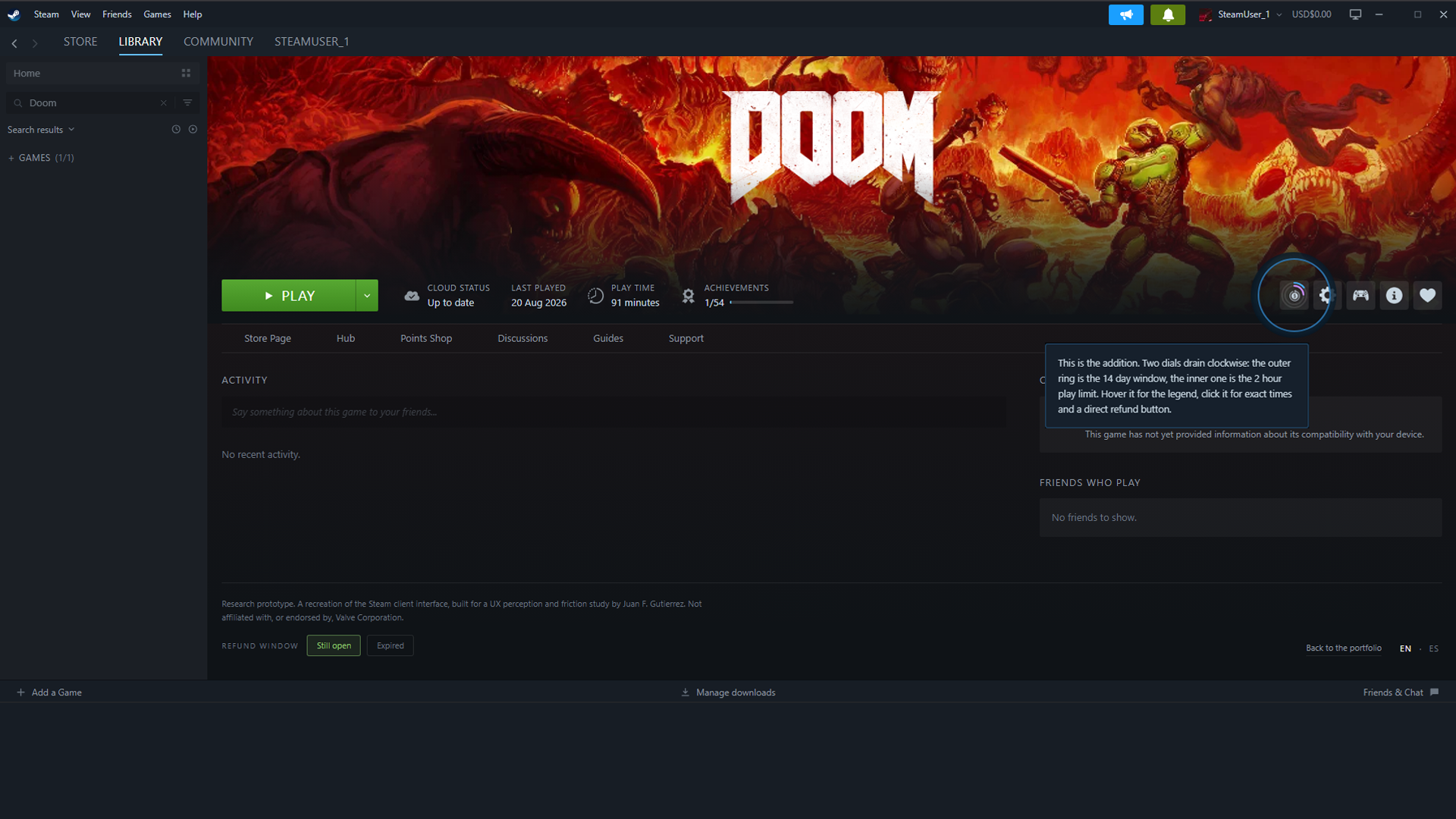
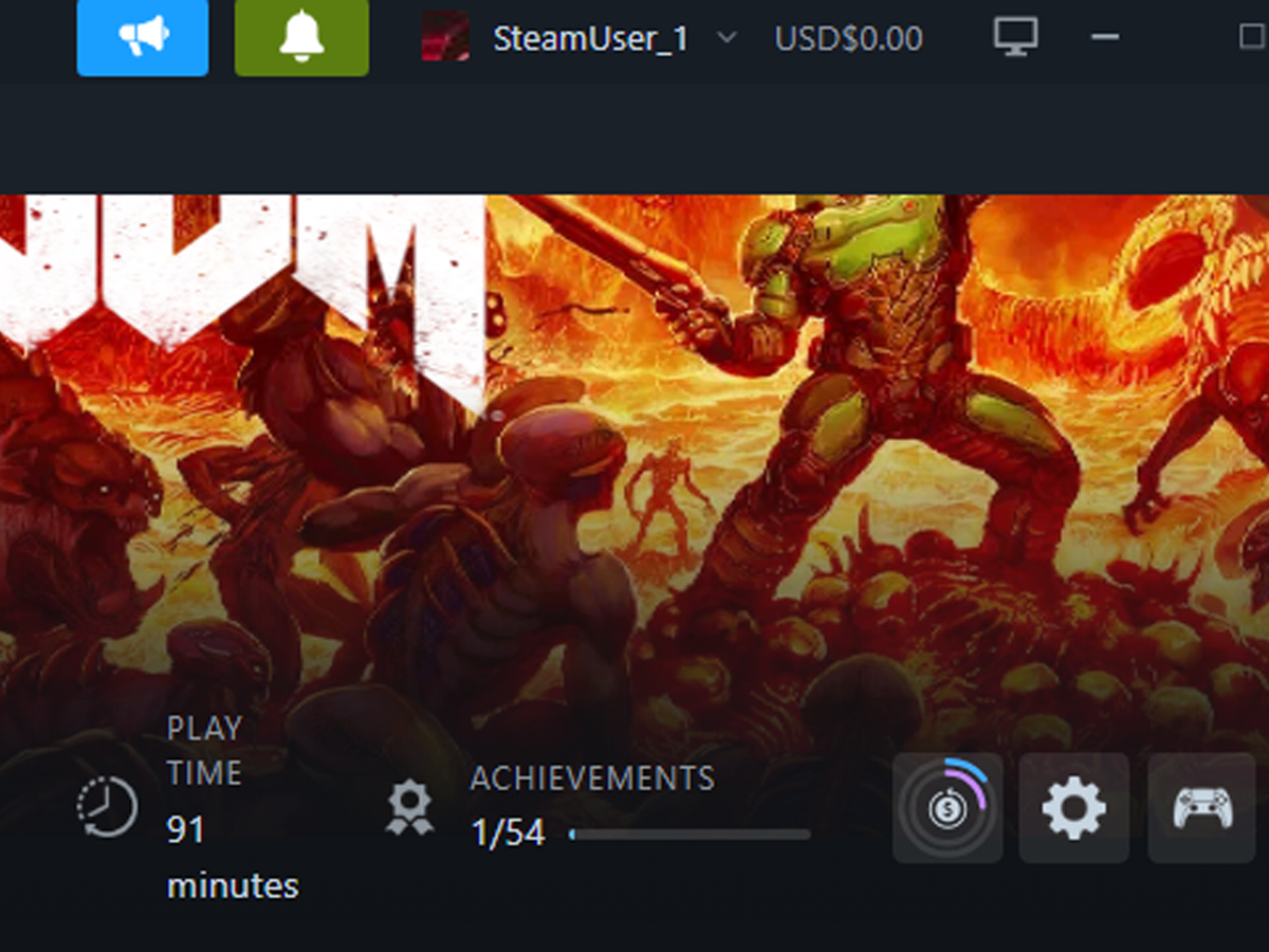
A mockup of an owned game's Steam page, showing the proposed refund-status indicator placed next to the settings icon.
IMAGE PENDING A mockup of an owned game's Steam page, showing the proposed refund-status indicator placed next to the settings icon.
The fix, in the place it would live
UX Research Usability Testing Heuristic Evaluation Survey Design Thematic Analysis Interaction Design Product Design Trust & Credibility Research Prototyping Front-End Development

01Overview

Steam's purchase flow tests extremely well on usability. The one real gap a joint academic study found was refund information nobody could find when they actually needed it, so I designed and built an interactive fix for it myself.

This case study covers two connected pieces of work. The first is a bachelor's thesis I wrote jointly with Cristian De Santis, evaluating Steam's five-screen purchase flow through a heuristic evaluation, a survey of 37 users, and semi-structured interviews. My half of the research focused on navigational structure and interaction design. Cristian's focused on pricing, discounts, and refund policy communication. Together, the study found a purchase flow that scores in the "Good" band on the System Usability Scale, alongside one consistent, specific gap: refund information was nowhere to be found, either during checkout or afterward.

The second piece is mine alone. After graduating, before starting my master's, I spent part of the summer designing and building an interactive fix for that specific gap: a refund-status indicator on a game's own page that also shortcuts straight to the refund request, and a small addition to the purchase flow itself. Neither has been tested yet. Both are proposed, working prototypes, not shipped features.

02Context

JOINT ACADEMIC RESEARCH, THEN SOLO DESIGN FOLLOW-UP

The research half of this project was a bachelor's thesis, written jointly with Cristian De Santis as what's known as a kappa thesis: two individual papers built on one shared study, each analyzing a different angle. We collected the survey and interview data together. My paper analyzed Steam's navigational structure and interface consistency against Nielsen's usability heuristics. Cristian's paper analyzed pricing, discount presentation, and refund policy communication through McKnight's trust model. His half is where the refund finding actually lives. This case study borrows it honestly, not as my own discovery, but as the shared research that led directly to what I built next.

The design half started after graduation, once the academic requirement was already satisfied. I built it over part of the summer, on my own, before starting my master's in interaction design, specifically to prove I could take a real research finding and turn it into an actual interaction, not just a recommendation in a conclusion chapter.

Constraint

The design work is a solo, self-initiated extension built after the thesis was already complete. It has no stakeholder, no deadline, and, as of now, no user testing behind it.

03The problem

Across a survey of 37 users and a set of follow-up interviews, Steam's purchase flow scored 81.69 on the System Usability Scale, in the top tier of usability benchmarks. Almost everything about buying a game on Steam tested well: navigation, pricing clarity, checkout consistency. One item broke the pattern. Refund findability at the point of purchase scored the lowest of any trust measure in the study, and in interviews, three out of five participants independently raised the same complaint: when they actually needed refund information, they couldn't find it. A platform can score in the 90th percentile on usability and still lose a user's trust over the one piece of information it hides.

04Research

This is the one case study where the research behind it was actually formal.

The study combined a heuristic evaluation of Steam's five-screen purchase flow against Nielsen's ten usability heuristics, a survey of 37 users combining the System Usability Scale with trust and credibility items adapted from McKnight et al.'s e-commerce trust model, and semi-structured interviews with a subset of participants, analyzed thematically. It was conducted jointly with Cristian De Santis. He analyzed pricing, discount presentation, and refund policy communication. I analyzed navigational structure and interface consistency.

A cognitive walkthrough was originally planned to complement the heuristic evaluation but couldn't be completed within the project timeline, and the sample skewed toward experienced users in a narrow demographic, both limitations the thesis states directly rather than something noted after the fact.

Survey respondents
37
Interview participants
5
SUS score
81.69
Refund findability
3.19 / 5

The specific finding this case study builds on: refund findability at point of purchase scored 3.19, the lowest trust item measured, while refund policy comfort among people who already knew the policy existed scored 4.32. The gap wasn't that Steam's refund policy is bad. It's that almost nobody could find it when it mattered.

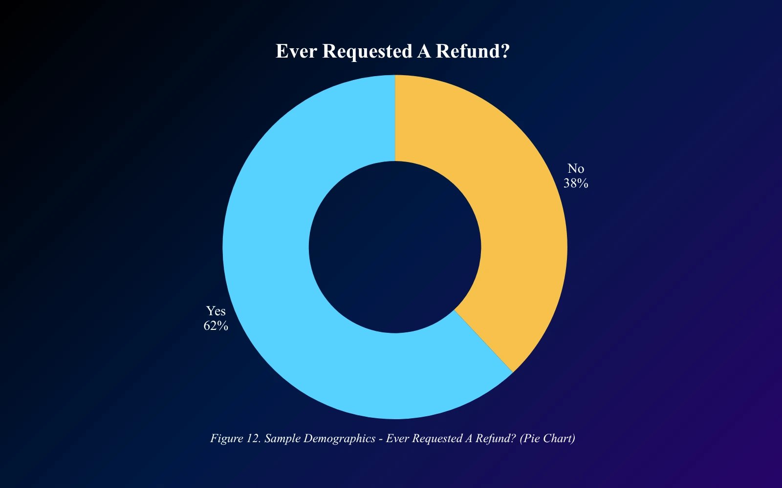
A pie chart from the thesis survey showing that 62 percent of respondents had requested a Steam refund at least once.
IMAGE PENDING A pie chart from the thesis survey showing that 62 percent of respondents had requested a Steam refund at least once.
From the survey, n=37

05Process

01 Research

Ran a heuristic evaluation and a joint survey and interview study with Cristian De Santis, over one academic term, ending in a shared thesis.

02 Isolate

Took one specific, well-evidenced finding, refund findability, out of the thesis and treated it as a design brief for myself.

03 Sketch

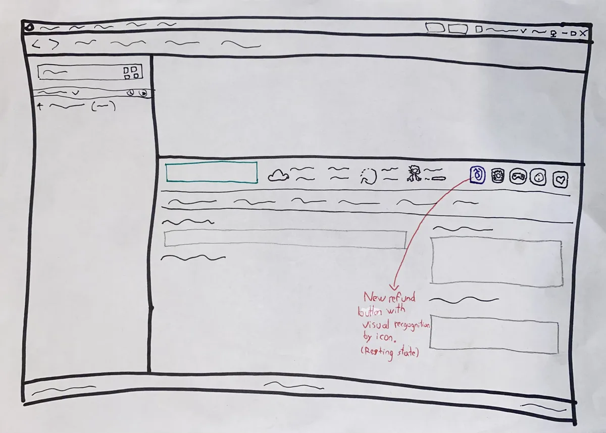
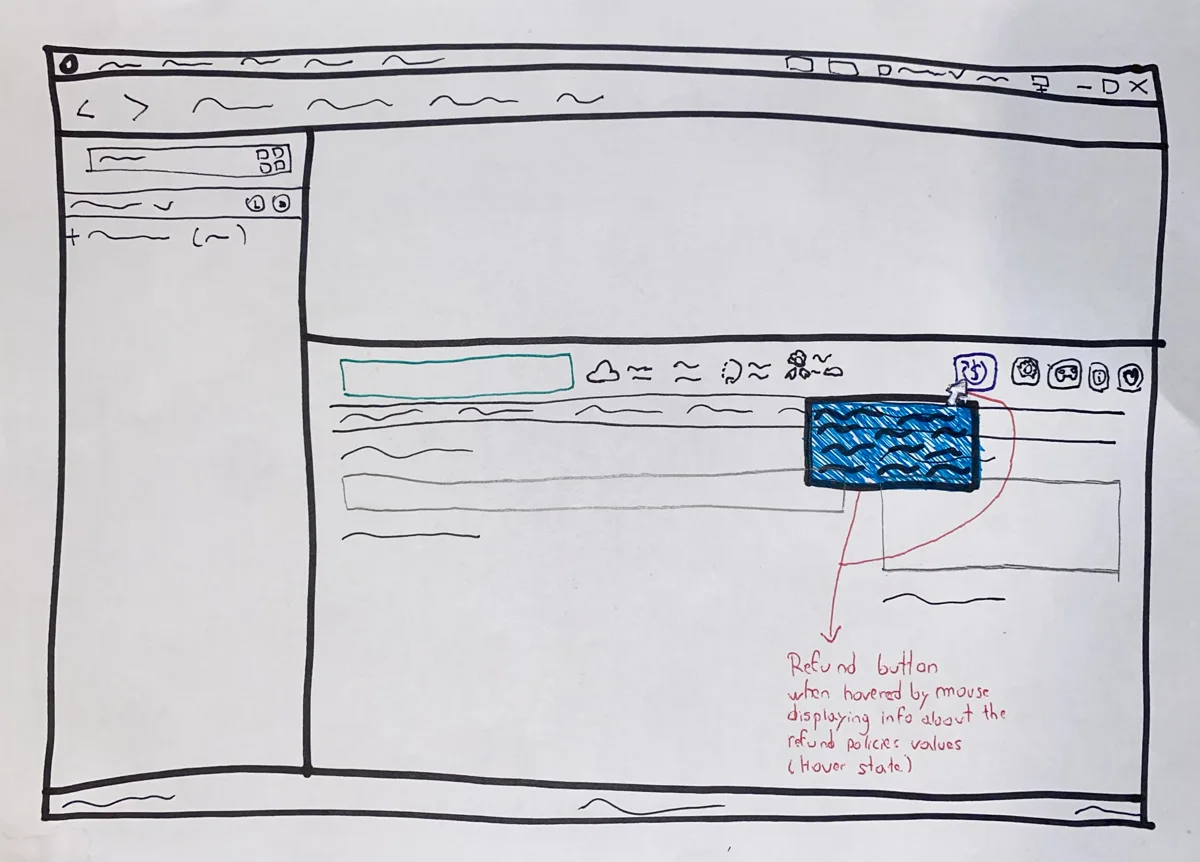
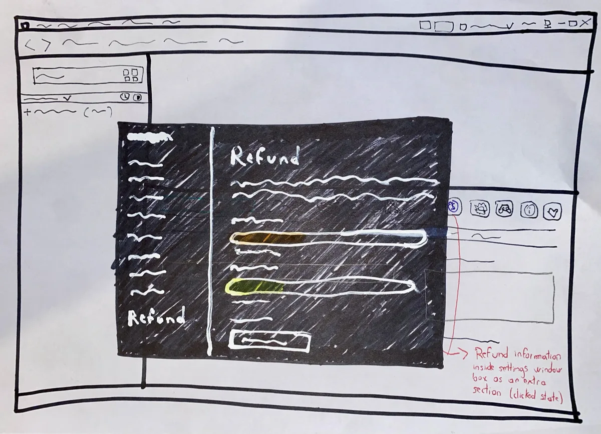
Drew the indicator's states and the cart-step addition on paper before writing any code, working out the interaction first.

04 Build

Built the game-page indicator as a working interactive prototype, and the purchase-flow fix as a documented before-and-after, over part of the summer.

The research and the design work are separated by a real gap: months, a graduation, and a change in what I was accountable to. Nothing about the design phase was required. That's deliberate. It's the clearest evidence I have that I can take a finding that isn't mine and do something useful with it on my own initiative.

06Decisions

Decision 01

Two concentric dials instead of a countdown number

Problem
Steam's refund window is governed by two limits at once, 14 days since purchase and 2 hours of play time, and whichever runs out first ends it. Both needed to be visible at a glance, without asking anyone to read two numbers and work out which one binds.
Options
A text countdown, "9 days left," a single dial showing only whichever limit was closest to running out, or one dial per limit.
Chose
Two concentric rings on a single button, each draining clockwise from twelve o'clock like a clock face. The outer ring is the 14 day window, the inner one the 2 hour play limit, and each has its own hue rather than being two shades of one colour.
Why
A number requires reading and a small calculation, and a single dial would have hidden which of the two limits was actually about to end. An emptying ring communicates "there's still time" or "it's almost gone" instantly, the way a loading bar or a clock does, and two of them say it for both limits at once. Two hues rather than two shades is what lets a legend name them separately.
Result
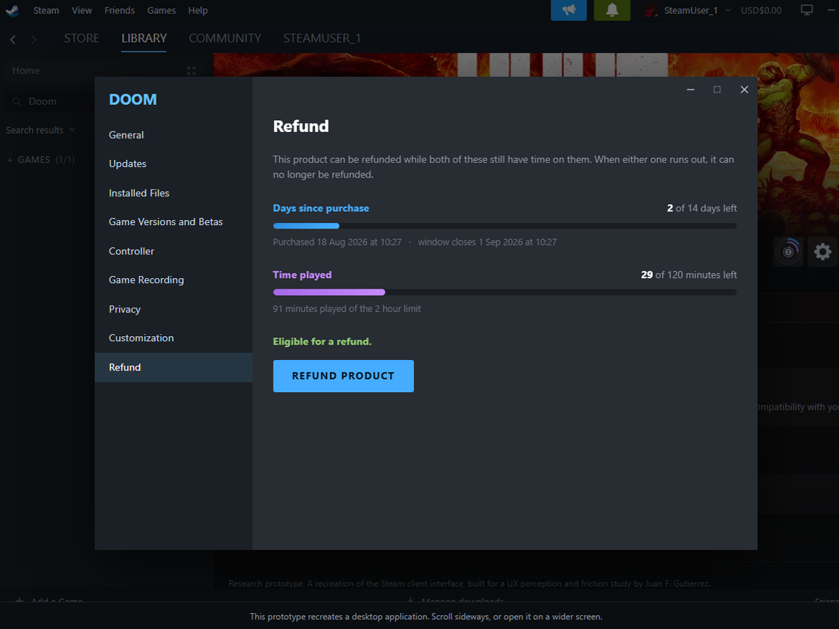
Both constraints are readable in a glance, with the legend one hover away and the exact times one click away.
Decision 02

Two touchpoints, not one

Problem
The research showed the friction wasn't a broken purchase flow, it was that refund information was invisible both while checking out and afterward, and one interview participant specifically suggested surfacing it near the purchase button.
Options
Concentrate the fix entirely in the purchase flow where a participant suggested it, build the ambient indicator on the owned game's page and leave the purchase flow alone since it already scored well, or address both.
Chose
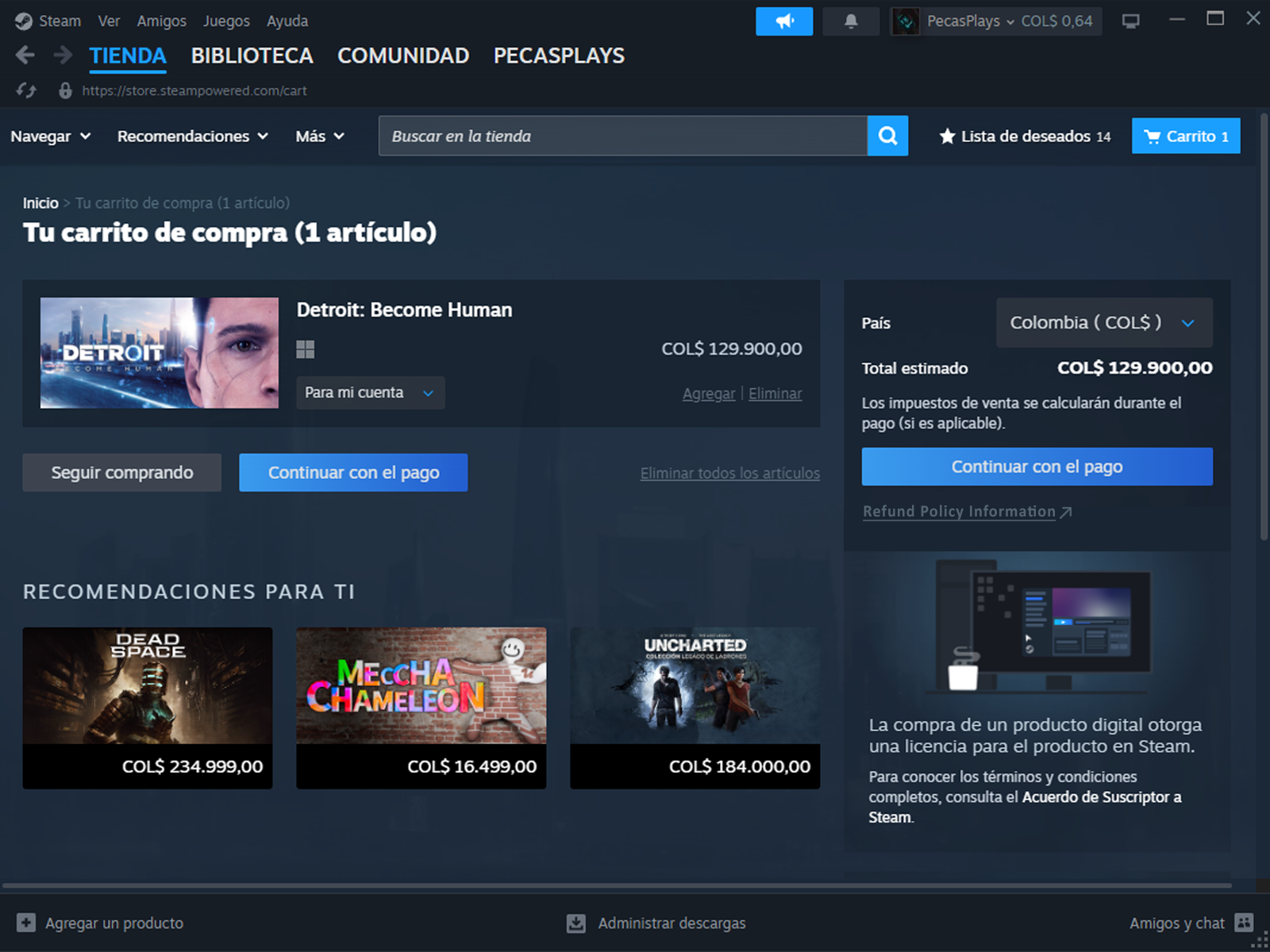
Both. An ambient refund-status indicator on the owned game's page as the main fix, and a single, low-key link labeled "View refund policy" placed below the checkout button in the cart step, pointing to Steam's own refund policy page.
Why
The purchase flow scored well overall, so redesigning it risked adding friction to something that already works. But the flow still doesn't reference refund information anywhere, which is the exact gap the research flagged, and it costs almost nothing to add a single honest link where a real participant said they'd look for it.
Result
The moment someone's most likely to actually need refund information, days after a purchase, gets a real, ongoing indicator. The moment a participant specifically asked for gets a small, low-risk addition.
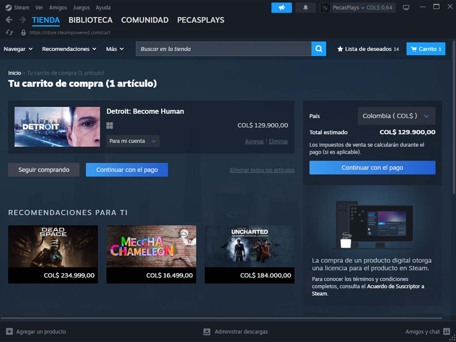
The purchase flow's cart step as it currently exists, with no reference to refund policy anywhere on the screen.
IMAGE PENDING The purchase flow's cart step as it currently exists, with no reference to refund policy anywhere on the screen.
Before
The same cart step with a small "View refund policy" link added below the Continue to Payment button.
IMAGE PENDING The same cart step with a small "View refund policy" link added below the Continue to Payment button.
After
Decision 03

A full interactive build for one fix, a documented before-and-after for the other

Problem
With limited solo time, both proposed fixes could have been built to the same level of polish, or effort could be spent where it would actually prove something.
Options
Build both as fully interactive prototypes, or match the build effort to how much interaction each fix actually needed.
Chose
The game-page indicator is a working interactive prototype: the two dials, the hover legend, and a Refund section in the game's settings dialog carrying the exact times and a direct refund button. It can be switched between a live refund window and an expired one, since the expired state is half of what the pattern has to communicate. The cart-step link is documented as a before-and-after comparison with a short explanation, not built as a live interaction.
Why
The indicator is a new pattern nobody's seen before, the only way to know if it actually reads correctly is to build it and interact with it. The cart-step fix is a single line of text pointing to an existing page. A screenshot and a sentence show exactly what it does.
Result
One polished, testable centerpiece instead of two partially finished ones.
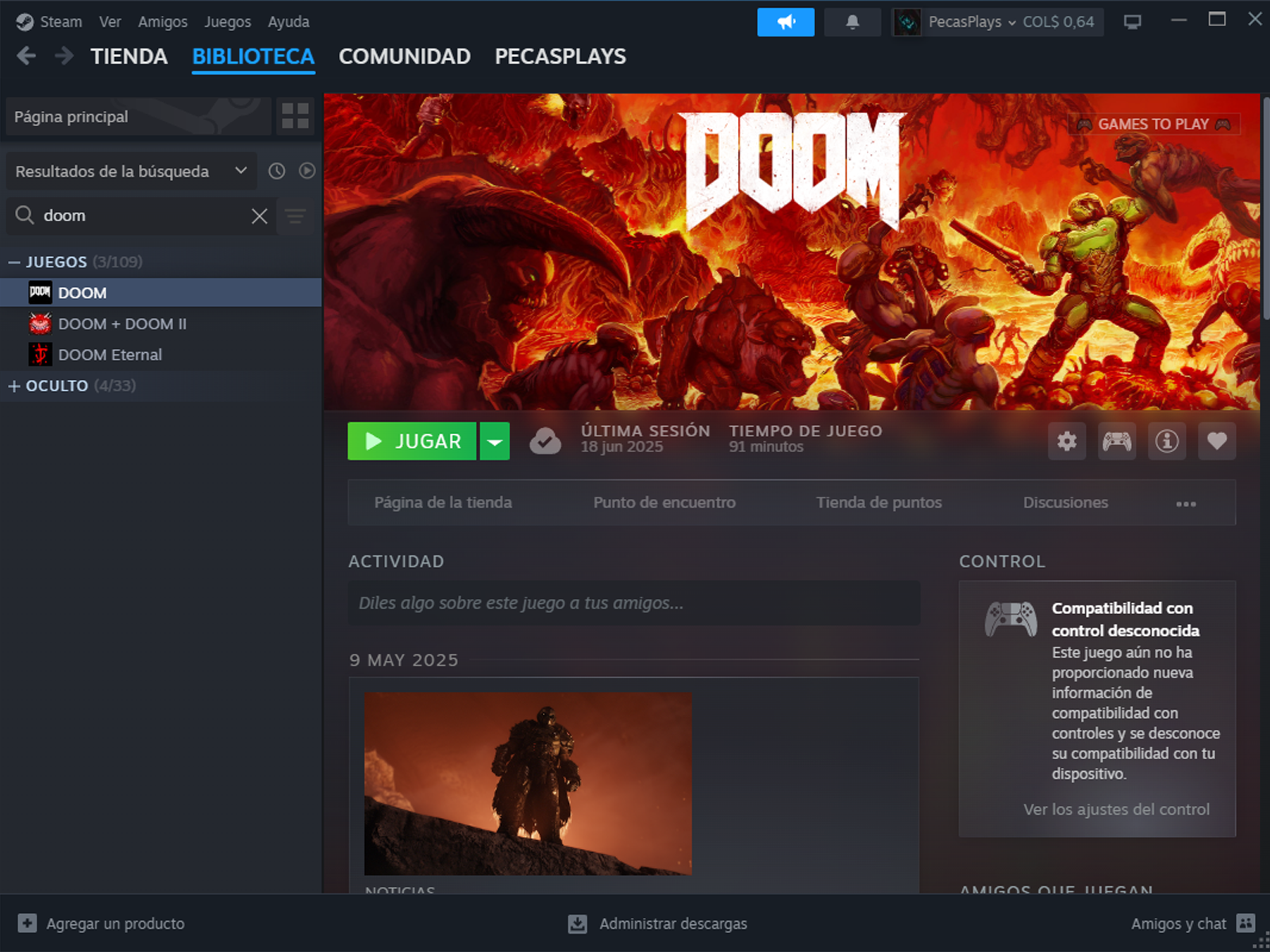
An owned game's current Steam page, with no refund status information visible anywhere.
IMAGE PENDING An owned game's current Steam page, with no refund status information visible anywhere.
Before
The same game page with the proposed refund-status indicator placed beside the settings icon.
IMAGE PENDING The same game page with the proposed refund-status indicator placed beside the settings icon.
After

07Outcome

THESIS SUBMITTED · TWO PROPOSED FIXES, UNTESTED

The thesis was completed and submitted as planned, with the navigation and usability half as my own contribution and the transactional half as Cristian's. Both proposed fixes exist as working material: the game-page indicator as a functioning interactive prototype with real hover and click states, and the cart-step addition as a documented before-and-after with the actual copy it would ship with. Neither is live on Steam, obviously, and neither is going to be. This was never a pitch to Valve. It's a demonstration that a specific, well-evidenced research finding can be turned into an actual interaction, not just a line in a conclusion chapter.

There's no usage data to report, since nothing here has real users yet. What exists is a complete, defensible chain: a measured problem, a specific number behind it, and a proposed fix that addresses that exact number, sketched, built, and ready to be tested.

08Reflection

The thesis proved I can measure a problem carefully. This project is what happens when I stop measuring and start designing.

Building on Cristian's specific finding rather than my own required being honest, with myself and now with anyone reading this, about which part of the research was actually mine. That's a strange thing to have to state clearly in a portfolio, but it felt more useful than blurring the line, especially applying to a field where being precise about what you did and didn't do is a large part of the job.

The clearest gap, and my own thesis names it directly: neither proposed fix has been usability tested. I designed both from research findings and my own judgment as a designer, not from watching anyone actually use them. My own conclusion chapter recommends exactly this kind of targeted test as future work. I haven't done it yet.

Limitation

Neither proposed fix has been tested with a real user. Both are designed from research findings and informed judgment, not observed behavior. My own thesis recommends a targeted usability test for exactly this kind of intervention. That test hasn't happened yet.

still the test my own thesis recommended